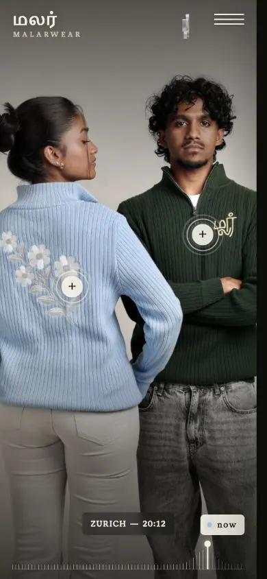
What the website had to deliver.
The visual warmth and intimacy of the work had to come through without the website competing with the photography. At the same time, a large image archive needed to stay fast and effortless to navigate.

A cinematic web presence for wedding photography and film, where emotion, imagery and large-format content take centre stage.
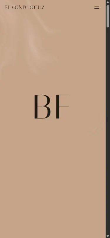
The visual warmth and intimacy of the work had to come through without the website competing with the photography. At the same time, a large image archive needed to stay fast and effortless to navigate.
A calm, cinematic pacing pairs large-format media with restrained typography. Generous space, controlled transitions and a warm base tone let the stories breathe.
The interface was built mobile-first. Responsive media areas, progressive image loading and reduced motion keep the visual impact intact even on weaker connections.
These views show how the visual idea carries across large and small screens.
Your project could be the next one.